Table of contents
Unless you’re living under a rock, you must have caught wind of the laser-sharp focus that WordPress has been putting on Gutenberg lately. While some web creators are still in denial, refusing to believe that the block editor is the future of WordPress, there are also some early-ish adopters that are setting their web design business up for the future and getting familiar with Gutenberg.
If you’re team Gutenberg, you might still have minor issues with the block builder’s functionality here or there, which is kind of a bother, but manageable. But as of this moment, there’s a crucial factor in terms of Gutenberg’s usability that’s actually more than just a minor detail.
Let me explain: WordPress users around the globe have been commenting about hickups on the way to creating truly responsive websites with the block editor. This leads me to ask:
Is WordPress Gutenberg Responsive?
In terms of current WordPress developments, this seems to be the million-dollar question.
As we all know, it’s not enough to build a website on your big, fancy web designer screen and then take the last day of the project to make it work on mobile devices. While this might have been the way to go at some point, it has been replaced by mobile-first indexing (or even mobile-only indexing, if you ask Google).
Making websites truly responsive is not just a goodie.
It is the bare minimum.
As for my experience, I kid you not – this is the way I felt when I tried to create a responsive website with Gutenberg:
*phone rings*
“Operator?”
“I’d like to place a call to Johannes Gutenberg – I have some questions about the future.”
“I’m sorry, Mister Gutenberg is currently not very responsive.”
You are currently viewing a placeholder content from Default. To access the actual content, click the button below. Please note that doing so will share data with third-party providers.
More InformationWhen used on its own, things are not looking good for Gutenberg. Allow me to explain what I mean: WordPress is on a good way when it comes to the block builder, but when it comes to responsive web design it’s definitely not there yet. Here are some pros and cons:
Pros of Gutenberg Blocks for Responsive Webdesign
Let’s start with the good news first: Gutenberg lets you stack elements on top of each other instead of side-by-side. This is a huge step forward when comparing Gutenberg to Elementor or other page builders.
With page builders, you can choose to display or hide elements depending on the screen size. But this is hardly enough – and also: it creates even more code. Which leads to bad performance. Which leads to bad SEO. Trust me, Google isn’t particularly impressed by duplicate content.

Mobile Stacking Option in Gutenberg
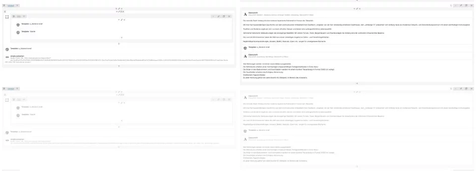
Duplicate Content for different screen sizes as often seen as the only responsive option in pagebuilders
Cons of Gutenberg Blocks for Responsive Webdesign
Well, let’s keep this one short and sweet: There are really hardly any options within the blocks in regards to responsiveness.
But fear not – as always, there are ways around this, and you can definitely make it work.
How to Make Gutenberg Really Responsive
We’ve established that Gutenberg, used on its own, is lacking the functionality that’s needed to create responsive websites. There are a few workarounds to combat this. One of them is, of course, hiring a developer – which, of course, is very expensive.
There are tools to help you along the process that complement Gutenberg’s strengths by making up for its weaknesses. As always, though, you have to balance the pros and cons of adding yet another tool or plugin to your site. After all, you want to keep your code light and lean, not weigh it down with dozens of plugins – which I’m sure you’re fully aware of.
Tools to Make Your WordPress Gutenberg Website Responsive
After all of this talk, I want to go into some practical examples of what you can do (or use) to help create the best possible experience for your website’s users – no matter the device.
Let me list some of the best solutions for you. Some of them are perfectly compatible with the WordPress block editor – and I’ve also included one superhero that is fully integrated with Gutenberg as well.
Now for the fun stuff: Let’s get into the tools!
Gutenberg Blocks Library & Toolkit – Editor Plus
This plugin is a promising no-code style editor that lets you “extend” your whole Gutenberg experience.
Apart from providing a better experience when designing for all different devices, Editor Plus offers different styling options like borders, background, box-shadows, animations, etc. Of course, you can also add your own CSS code.
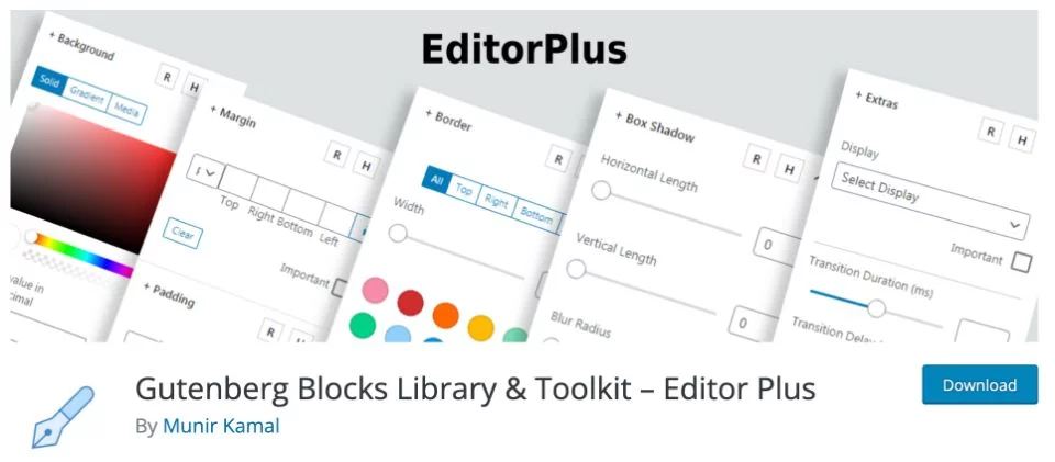
Missing a progress bar block, or a countdown timer block within Gutenberg? Editor Plus has got your back.
MBM Gutenberg Blocks
The designers over at Made by Munsters have struggled with Gutenberg’s lack of responsive abilities as well.
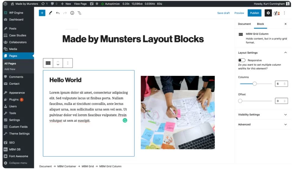
How did they solve it? By creating a responsive grid layout – for anyone and everyone to use. You can read up on it right here on the Made by Munsters website.
Responsive Gutenberg Blocks Library
Another plugin to help you with all your responsive Gutenberg needs!
The Responsive Gutenberg Blocks Library by CyberChimps offers completely customizable advanced blocks to help you create your unique look – of course, fully responsive.
GREYD.SUITE
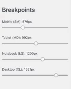
By including a bootstrap grid, GREYD.SUITE lets you choose from four different screen sizes (If you’d like to change them, though, you can: All four breakpoints can be altered to your preferences).
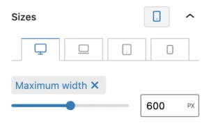
Also, in terms of width, height, or margins, almost all blocks have their own responsive settings.
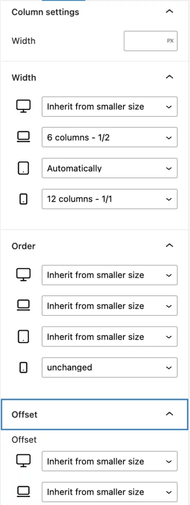
Lastly, GREYD.SUITE offers highly detailed column settings – this means you can define the order of your blocks or even indentations for each breakpoint individually, without having to add your content twice with different settings (because WHO would want to do that).
If this is the first time you’re hearing about this tool, you’re in for a treat. Because GREYD.SUITE does much more than just help you create responsive websites with Gutenberg.
Why choose GREYD.SUITE for your web design business?
With GREYD.SUITE, creating highly professional websites has never been easier – and quicker. As the world’s first all-in-one WordPress Suite with a native Gutenberg integration (yes, you heard that right), GREYD.SUITE is committed to providing anything you need to create fast-as-lightning websites – no code or plugins needed.
You’ll be faster at what you do, all the while creating websites that are so elegantly coded, they’re faster than any page builder could ever deliver.
Put it to the test and get started for free today!
Bottom Line
To make your web design business future-proof, you have to go the Gutenberg route sooner or later if your favorite CMS is WordPress.
Remember: The best time to make the switch to Gutenberg is now!
But keep in mind: To use it to its full potential, some tools will make your life so much easier.


