

Mobile-first indexing has become crucial for web designers. If you want search engines to be able to find your website, you must follow the rules of mobile-first indexing. Your web design clients will focus on mobile-first design more and more.
In this article, we look at what this means for you as a web designer, and how you can include mobile-first indexing in your design process.
What Is Mobile-First Indexing?
Mobile-first simply means that Google bases its rankings on the mobile version of your website. And what does that mean in practice? Very simple: Mobile design has officially surpassed desktop design in terms of importance.
Mobile first, desktop second.
In this article, we look at how mobile-first works and what it means for your work as a web designer. You will be particularly interested in the best practices for mobile-first design.
A Brief Background: How Does Google Mobile-First Indexing Work?
In case any of your clients ask, here’s a quick overview of how mobile-first indexing actually works:
Google uses a crawler, i.e. a bot that looks at all the links and subpages on your website. This crawler used to look at two variants: the desktop version and the mobile version. But today, Google pulls all information about your site’s content and potential ranking signals from the mobile version. Accordingly, only the mobile version is evaluated by Google to decide whether the content should be displayed in the search results.
How good your desktop design looks to visitors or how fast the desktop version loads are suddenly completely irrelevant (for SEO). Google officially says: Only the mobile version of a website counts.
Of course, this has an impact on the design process.
Why Mobile-First Is Important to Your Clients
Just imagine that Google is only interested in the mobile version of your site and your design. If the desktop version of your site loads quickly and has good UX (both important ranking signals for Google), that’s good. But if the mobile version takes more than 5 seconds to load and your visitors can hardly find their way around the page, then Google will “penalize” it.
Google only (or mainly) looks at the performance of the mobile version. Why? Because now 65% of all search requests come from mobile phones. Therefore, well-thought-out mobile UX and solid performance of the mobile version of a website is the be-all and end-all. It’s also a selling point for your web design clients, as we’ll see in a moment.
How Mobile-First Indexing Impacts Web Designers
Unfortunately, the technology of mobile-first indexing has not yet caught on with most web designers.
There is a simple reason for this: as a web designer you work with large screens. Therefore, many focus on the desktop version, which is in front of their eyes all day. Also, the desktop version of the design is also usually shown to clients during presentations to impress them.
In reality, however, hardly any of your client’s website visitors will end up on the desktop version (or view it on a huge 4k retina display). According to Digital Silk, 85% of all users find that the mobile version of a company website should be as good as, or even better than the desktop version. I think it doesn’t have to be just one or the other. If you offer your visitors an awesome experience on any device, everyone will be happy. Design for mobile devices should therefore no longer be an afterthought that you quickly deal with at the end of the design process.
Your Guidelines for Mobile-First Design
How can you use mobile-first web design in your client projects? First of all, there is an important mindset shift that you need to save yourself a lot of work with mobile-first design. But of course, there are also many solid guidelines that are essential for good mobile-first design.
Mobile-First: A Mindset Shift for Web Designers
We need a fundamental change in the design process. A mindset shift from desktop-first, mobile-second to mobile-first, desktop-second, and soon even mobile-only. Designing mobile-first means starting with the mobile version and later adapting the desktop version to it.
As a web designer, switching to a mobile-first approach will give you a competitive advantage.
In the future, your clients will increasingly demand that your designs work well on mobile devices. Mobile SEO is an important marketing strategy for many companies. They can’t afford to have a bad Google rating. If your design looks good but doesn’t perform well on mobile, your clients won’t like that at all.But if you take mobile-first seriously, it can even become a key selling point for your next initial meeting.
The Most Important Rule: Mobile-First = Content-First
Mobile users are distracted and want to get to their information quickly. The design, therefore, has the task of presenting content as clearly and logically as possible.
Provide a Clear Visual Hierarchy
Your mobile users should always be able to easily recognize the most important elements on the website. When the visual hierarchy isn’t right and, for example, an H3 heading looks almost exactly the same as an H2 heading, this quickly leads to frustration. And your website visitors are likely to leave the site. On a small mobile phone display, it is, therefore, all the more important that your users are clearly guided through the site.
Keep a Minimalist Approach and Focus On a Few Page Elements
Think carefully about which page elements you want to use in your design. In mobile-first design, visual consistency is even more important than usual. Therefore, do not introduce too many different elements or variants of them. Make it easy for your user to recognize and use the individual elements (like call-to-action boxes or text elements).
Always Have a Clear Call to Action
We always want to lead our users to an action, such as a newsletter signup.
In mobile-first design, this is even more important. Especially on the homepage. Users should immediately recognize what the page is about and what to do next (e.g. clicking on a well-placed button). On mobile devices, users do not feel like searching for information for a long time or thinking about what to click next. So make it as easy as possible for them to be guided through your website. Your user should never feel hesitant.
Use a “Back to Top” Button
“Back to top” buttons are very important, especially for e-commerce sites, so that the users don’t have to scroll forever. Every little bit of help for your user pays off, and a “back to top” button can easily be added to any website.
Don’t Forget to Link to the Homepage From the Logo Image
You’re probably already doing this. But if you’re not linking to the homepage from the logo image, this error can really annoy your users. Therefore, make sure that they’re always able to return back home quickly.
Keep the Navigation Bar Intuitive, Including Only the Essentials
As you have probably already noticed, good user guidance is one of the most important things in mobile-first design. Confusing navigation bars (perhaps with an unclear visual hierarchy) are a red flag in mobile-first design. So really ask yourself what items should be in the navigation bar. Keep it as minimal as possible and provide a clear structure.
Avoid Intrusive Popups
Popups that take up the whole screen are really annoying on a phone. Especially if the exit button is too small or hard to reach because the site isn’t optimized for mobile. So be careful when using popups. If you use them, they should always be surrounded by enough space, so that users can easily close them.
Test Your Design on Your Mobile Phone
You can identify the vast majority of UX problems yourself if you simply go to the website with a specific search intent in mind. So grab a phone to test your website multiple times during the design process and try to find your way around the website. If you have problems, your users will certainly have them too. Through intensive testing, you can save yourself some unpleasant questions on launch day when your clients and all their acquaintances go to the website and immediately come across problems. Be proactive and try to test as many scenarios as possible beforehand.
How to Master the New Challenges of Mobile-First Design
Mobile-first design will never leave us. As you can see, this changes the design process and new challenges await you.
Making a website responsive often was a lot of work. Now it’s suddenly all about the mobile website – but how can you save yourself a lot of work when designing it? Very simple: By using a solid tool for building your WordPress site.
It’s very easy with GREYD.SUITE. Our tool allows you to build high-performance websites natively with Gutenberg – and they will look impressive across all devices.
It’s very easy with GREYD.SUITE. Our tool allows you to build high-performance websites natively with Gutenberg – and they will look impressive across all devices.
If you want to test GREYD.SUITE for free, simply click on the button to get started!
Examples of Good Mobile-First Design
Above, we looked at the guidelines for good mobile-first design. But what does good mobile-first design look like in practice?
We have selected four examples from two different sectors for you.

Slack wants to convert website visitors to users. Therefore, the design is centered around the “Get Slack for Android” call-to-action.
The site is minimalistic and has very few elements on the homepage. The visual hierarchy is made clear through colors and font sizes.
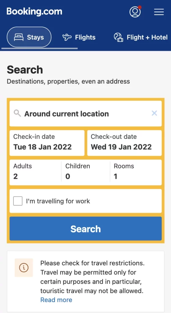
The Booking.com website is also clearly aimed at a single goal. It invites visitors to start a search inquiry for accommodation. Hence this search form takes up more than 50% of the space. Other, less important visitor intentions, such as researching flights or logging in, can be found in the navigation bar. Although this design is not quite as minimalist as Slack’s, it is still very clear and clearly structured. And like on the Slack website, the visual hierarchy is clearly highlighted with different colors and font sizes.
Use Free Mobile-First Index Tools
How do you actually know if a website is optimized for mobile-first indexing? If you want to find out quickly, there are free tools for that.
For example, you can use the Mobile Friendly Test by Google. Just add a domain and you’ll get a checklist of criteria relevant to mobile-first indexing. You will learn whether the website already checks all the boxes, or whether there is a need for action. This way, you can quickly check whether a website is fit for mobile-first. And if you pass this information on to your clients, they certainly won’t complain.
Mobile-First Design Is Here to Stay
Mobile-first indexing has not only changed search engine marketing, but also the requirements for good web design. With mobile-first indexing, the mobile version of a website is now the ranking criterion for Google.
Good UX, fast loading times, and low bounce rates on the desktop site have become irrelevant (for Google). For web designers, this means a change: the desktop design should no longer be prioritized. The mobile theme should be created first, as it is the top priority. This design can then be responsively adapted to other display sizes.
In order to continue to design mobile websites that rank well on Google in the future, there are already a few best practices to consider. If you follow these guidelines, you can use mobile-first indexing to your advantage. Because it will be a great selling point for your next pitch!