
Table of contents
Some companies present it with pride, while others have hardly bothered with it yet: The company homepage. What you should consider when creating your company website and what cool tips there are, you will learn in this article.
Even if you have your company homepage created by a web designer, this article will be useful for you to know what really matters in really good company homepages.
Why a Good Web Presence is Important for EVERY Company
Is this something that needs to be seriously discussed in this day and age?
Let me get straight to the point: If you run a commercial business but don’t have a professional company homepage, you’re bleeding money!
At least, if you don’t close your company within the next 3 years – because then it wouldn’t be worth the effort. Although the likelihood of you having to close down increases significantly with a non-existent company homepage.
Imagine you want to go out for dinner tonight and you have to decide on a restaurant. You are standing in front of two restaurants. One is mega nicely decorated and makes a good first impression.
The second restaurant, on the other hand, is the exact opposite. It looks completely outdated and somehow unserious. Which restaurant would you choose?
Probably for the first one, because it has a convincing appearance. The food at the second restaurant might be just as delicious, but no one will ever know that because the first impression doesn’t fit.
It’s no different with your company homepage! Your products and services may be top-notch. But before someone buys from you, they only know how good your marketing and your internet presence is.
Of course there are some absolute minimum requirements for modern company websites. These I would like to bring you in the next point a little closer.
Must-Haves of a Professional Company Website
Every professional company homepage should include the following points in this day and age:
A clean start = Above the FoldClear calls-to-actionHigh quality contentPossibility of contactingImprint and data protection
1. The Start: Above the Fold
In web designers’ jargon, the topmost area of a website, which is visible immediately after loading, is called “Above the Fold”.
The term comes from the era of daily newspapers, where the most important news was presented above the fold, so that it would be read first.
The opening should not overload your visitors with too much information right away and familiarize them with your color design.
“Keep it simple,” is the motto.
We humans in the digital age have a very short attention span. Only 8 seconds, as a study by Microsoft Canada once found out.
In concrete terms, this means for your company homepage that you have a convincing headline above the fold that presents your offer in an understandable way. Then a clear call to action (explained in more detail in the next point) and that’s it!
Additionally, you can include a static image or video that introduces your business and its benefits. We don’t think much of pretty slideshows with huge image files, because they slow down the loading speed.
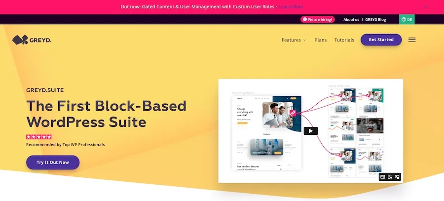
Here in the picture you can see the start of our own company homepage. So you can see that we don’t just preach water and drink wine.
At GREYD, you’ll only see our claim “The First Block-Based WordPress Suite” with calls to action underneath and a teaser video next to it.
Advice: On mobiles, where the screens are smaller, your headline should be seen first and only then your video – if you also include a video in the entry area.
2. Clear Calls-to-Action
What do you want your visitors to do once they land on your homepage?
The answer to this question is your call-to-action. A button with an unmistakable call to action can work wonders and is one of the must-haves for a reason.
Your CTAs absolutely have to be clearly recognizable, i.e. stand out from the rest of the page in terms of color, and actively prompt visitors. Otherwise, it would be a call to action at best.
In WooCommerce or Shopify online stores, you often see call-to-actions with “Buy now” or “Add to cart”.
For web designers or online agencies, on the other hand, “Contact me now” or “Make an appointment” would be a better choice to lure prospects into the first conversation and close the deal there.
3. Content, Content and more Content
A website without content would look pretty empty. This applies to all websites, not just the company homepage.
Content can basically be anything that says something. Text, images and video are used most often. Audio is also welcome, for example if you run a podcast.
However, the main focus here is on texts. Formulating the right website text can be a pretty intimidating challenge if you do it infrequently. You’re asking yourself questions like, “Is it okay to word it this way?” or “What if this is misunderstood?”
So… what do you put on the home page of a homepage?
Visitors to your homepage are always subconsciously asking themselves “Does this company offer a solution to my problem?”. You should answer this question as best you can through text.
Keep your homepage content to the rule: As short as possible, as long as necessary!
Psst… should I tell you a secret?
Professional and modern company homepages are built with GREYD.SUITE!
With this all-in-one tool you don’t have to worry about the first online impression of your company anymore.
4. Possibility of Contacting
You have convinced the visitors thanks to your content and they have followed your call to action. But all this is worth nothing if they can’t get in touch with you or your company if they have any questions.
It doesn’t matter whether your company is a web store, a software provider or a service company. The reference to a contact possibility belongs to the minimum requirements. In addition, it looks massively unserious if you deny potential customers the possibility to contact you.
The most popular ways to contact a company on its homepage are by phone or by email. The respective information in the footer area or at the top of the website menu is sufficient for this.
5. Imprint and Data Protection
Every commercial enterprise needs an imprint for legal reasons. In Germany, this is stipulated in § 5 of the Telemedia Act (TMG) and § 18 of the State Media Treaty (MStV).
Thanks to the GDPR and the bureaucratic hurdles that come with it, you should also create a separate subpage for your privacy policy.
Considering how complex the topic of cookies for marketing and analysis purposes has become, this should not be taken lightly.
In the meantime, there are already generators that greatly simplify the creation of an imprint for the company homepage and a privacy policy. In order to be on the really safe side with the latter, however, a discussion with specialized legal advice would be recommended in any case.
The Ideal Structure of a Company Website
You now know which individual elements should be present on every company website. Now let’s look at the structure of the homepage and the order in which the elements should appear when a visitor first lands on your page and scrolls from top to bottom.
At first glance – this was already discussed above – the visitor should only see a convincing headline, a clear call-to-action and at most an image/video.
In addition, your homepage needs a menu that can be used to navigate easily to the various subpages and, most importantly, a prominent CTA.

After the first impression, when the visitor scrolls further down, your offer should be described in a little more detail and what your unique selling proposition is.
But be careful: At this point, it is sufficient if only a brief description is given. For more information, refer to a separate subpage where your product or service is explained in more detail.
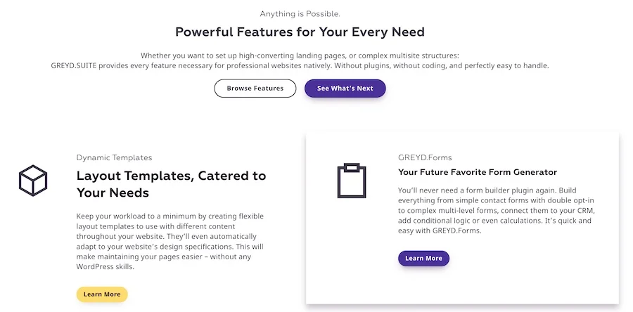
An example of how we at GREYD antease the various features and then link to our own subpages.
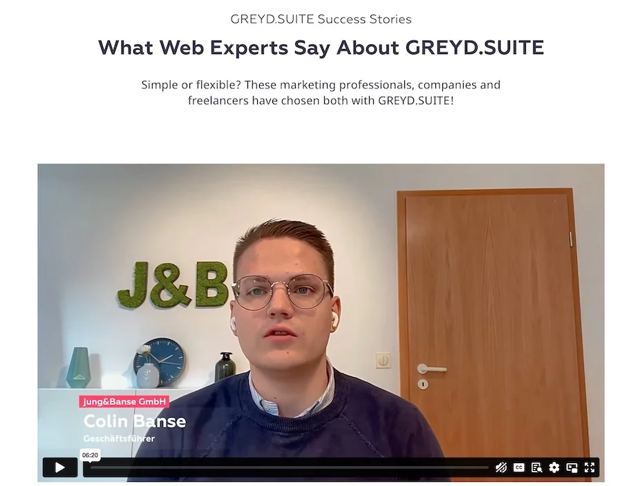
Once you have informed your visitors about your offer, it’s time for a little “social proof”.
Social proof means nothing more than confirming to the visitor the positive impact of your offer.
This can be in the form of testimonials – these are customer testimonials – or in the form of company logos of your previous customers. Of course, a combination of both would be best.
Normally, you don’t need more than three or four testimonials. But if you include them in the form of a space-saving carousel, you can have a few more.
And please don’t forget to place a few calls-to-action every now and then!
Call-to-actions could be compared to salt in cooking. Too little and it gets boring. Too much and people quickly bail. Sprinkle the right breeze over your homepage and your visitors will love it.
If your business website is just a longer one-pager, feel free to add a short “About Us” section to the homepage. Otherwise, it would always be better to create a separate subpage for it, where you can go into more detail about your company’s history.
Finally, add a nice footer that allows users to navigate through your site or switch to your social media channels and the homepage structure is on solid footing.
Of course, other special features could be included, such as a newsletter sign-up form. But this would then deviate strongly into the area of online marketing, which no longer has anything to do with the actual homepage.
And by the way, if you always want to be informed first and get cool articles directly in your inbox, then sign up here directly for our newsletter!
The Secret Weapon in Maintaining your Company Homepage: the Content Management System (CMS)
A content management system helps you manage all the content and design of your website and change it at any time at will.
In the meantime, it has become unusual to publish a company website that does not run with some form of CMS in the background. But since there are various offers on the market, we want to briefly discuss a few of them.
WordPress
There’s not much to say about WordPress and its Gutenberg editor that hasn’t already been mentioned in our other articles on the GREYD blog anyway.
WordPress has become by far the most popular content management system over the years and is expected to crack the 50% market share mark soon. The platform is now so well known that it is a household name even to those people who have little understanding of web design.
For your WordPress company homepage, there are endless themes and plugins available to customize the design and features to your liking.
Of course, the CMS must be mentioned here because our GREYD.SUITE is based on WordPress.
With the combination of WordPress and GREYD, all doors are open to you when building a professional company homepage and there are practically no more limits.
Jimdo as an Alternative for Laymen?
Jimdo is a German company that has made it its mission to simplify web design for laymen and with which you can easily create your own company homepage.
Jimdo carries out this mission really well. But it has little to do with an actual professional company website that is individually crafted according to your needs.
Sounds harsh, but when you compare it to the options available to businesses with WordPress as a CMS for web designers, Jimdo looks a bit pale in comparison.
Modular Systems
Many web hosts – such as 1und1 – offer integrated construction kit systems, with which you can easily design your own homepage.
This option is more comparable with Jimdo than with WordPress. Such website construction kits do not have much to do with a content management system, because the user is massively limited.
Individuality is almost non-existent in modular systems – that’s just the way modular systems are.
Admittedly, we are a bit biased because our product is based on WordPress. Nevertheless, we don’t see many attractive alternatives when it comes to content management systems that allow for both ease of use and a customized design of a company homepage.
Conclusion
There are several points you should consider when building a professional company website.
The list of must-haves is a good starting point, which you can use as a guide when creating the website. With this you already know roughly how a good company website should look like.
You can be flexible with the order of the different elements. However, don’t forget that your company website must ultimately sell in order to fulfill its purpose. This requires clearly recognizable calls to action, which should not be used too sparingly.
If you decide to use a content management system to build your business website, we clearly recommend WordPress. In our opinion, it offers the most advantages of all the alternatives.
Build a company homepage that not only looks beautiful, but also increases your sales!
With GREYD.SUITE you can build websites that will make your visitors’ mouths drop open. Of course, testing is free of charge for you.