Table of contents
If you’re a fellow online marketer, you’ve read your fair share of recommendations to help get more leads – and better leads – just by tweaking a few things in your conversion form.
But what if your form still doesn’t perform well?
What if, instead of gaining leads, you’re essentially losing customers because of your form?
Let’s pause for a second here, take a deep breath and ask ourselves this question:
Have your conversion forms fallen from grace, because you just couldn’t stop optimizing them?
Is it possible that you focused on absolutely mistake-proofing your forms, and forgot the one key element of creating anything worthwhile clicking:
Having some fun along the way… and doing some testing to know how to get there! Because, as anyone who’s ever watched Friends knows: We need to control the fun.
Klicken Sie auf den unteren Button, um den Inhalt von giphy.com zu laden.
If we do vigorous testing, we can try out fun features and fall back in love with building conversion forms – because they’ll actually convert.
But for anyone who’s been scratching their heads for the past minute-or-so, asking: “what even is a conversion form?”, let’s take a step back, and clarify the fundamental question:
What’s a Conversion Form Exactly?
A conversion form is used by businesses to collect user data (name, email address or other information) to complete a predefined goal (=conversion).
This could be:
- making sales
- generating leads
- sales leads
- and a million other things, depending on what action a business wants their users to take.
Basically, they could be anything from contact forms to feedback forms – or even research forms.
If you want to track the performance of your form, here’s a helpful formula to keep in mind:
You can measure performance by tracking your conversion rate:

C’est formidable! Right?
Now that we’re done discussing what a conversion form is, let’s get to the fun part: How to build a click-worthy form.
Klicken Sie auf den unteren Button, um den Inhalt von giphy.com zu laden.
Covering the Basics: How to Build a Good Conversion Form
At this point, I’m also assuming that you’ve covered all the basics regarding your form:
- You’ve made sure it’s GDPR compliant.
- It has been adapted to your website’s design.
- It doesn’t look like it’s from the nineties, like the one in this example:

Great! You’ve managed to create a form that covers all the basics, and up until now everything sounds quite simple. Your form looks nice, and it respects your user’s data privacy. This is where you should start generating leads, right?
Well, there might be a tiny problem that, as much as we’d like, we cannot ignore…
The problem: Nobody likes filling out forms.
I’m just gonna say it: People hate filling out forms.
Here’s a little summary of my morning:
- 08:30: I just want to connect with the hotel wifi to write this blog post, why do you keep saying I have to state my room number to access it? I haven’t even had coffee and you expect me to remember what room I’m in? Give me a break…
- 08:36: Ok, I managed to connect to the internet. Now I just want to watch this music video in peace, but why would you want me to sign up to YouTube Premium?
- 08:39: Ok, I got the music going, I got my coffee – let’s do some research. Yes, I want to download your free ebook!
But why would you need my data for that? Ah, what the heck. I really want to download that ebook. There you go, here’s my social security number.*
(*Alright, I might have exaggerated in the last example. I didn’t end up reading the ebook, and I didn’t really give anyone my social security number. But you get my point. )
I’ll say it again: People hate filling out forms. It’s tedious, and everyone and their mom and uncle and their sister nowadays knows about data privacy (which, by the way: Good for them!). So you, as a web creator, have to give them a reason to jump through all the hoops you’ve set up for them.
When in Doubt, Follow the Mozart Method.
Ah, Mozart… Classical music virtuoso, Wunderkind.
You might think: What does this have to do with conversion forms, let alone great web design? But hear me out…
There is one factor that undeniably distinguishes Mozart’s music from his contemporaries:
His music doesn’t lack any notes. It has all the notes it needs.
But, also, his music has no fluff, nothing unnecessary.
This dialogue takes it home:
EMPEROR Joseph: Too many notes.
MOZART: I don’t understand. There are just as many notes, Majesty, as are required. Neither more nor less.
Of course, this is just a line from a movie, but it describes perfectly how to craft a user-friendly experience – in this case, a form.
How to use the Mozart Method for conversion forms:
- Remove the fluff.
- Make it as simple and intuitive for the user as possible.
- I also had a third sentence planned, because I love the rule of three. But then I deleted it, because basically it was fluff. You see what I did there?
Basically, the Mozart Method is supposed to help you eliminate hiccups, remove anything the users might stumble upon that might keep them from doing what you want them to.
After all, you don’t want them to just fill out your form halfway and then abandon it, because of error notices or other minor setbacks that could have easily been avoided.
Less steps = better conversion rates, we all know that.
But also: Less steps = less opportunity for setbacks.
Let’s see how we can identify the hiccups, so you can start having fun designing your forms.
How to Fall Back in Love With Your Forms and Get Better Form Conversions
What Really Matters for Your Form Conversion
Now comes the technical aspect of everything I described above. Up until now everything sounded more or less visceral. Keep your notepads ready.
Here’s exactly how to make yourself fall back in love with your forms and please your website visitors along the way.
(Please them, so they’re gullible. And they’ll give you your social security number for your free ebook. Insert evil laughter here.)
- Study heat maps to identify user behavior, and most importantly, any hiccups.
- Build a thesis.
- Perform A/B-tests to test your thesis.
- Work with the outcome.
- Repeat.
It’s as simple as this.
But enough with the theory – let’s go to some practical insights. I want to show you some conversion forms I’ve found that I think are noteworthy – and might help you gain some ideas.
Conversion Forms: Best Practises
Example 1: Hootsuite
A few days ago, I was comparing Content Automation platforms. And there’s one that stood out – not actually in terms of functionality, but in terms of this glorious piece of conversion form you’re going to witness here:
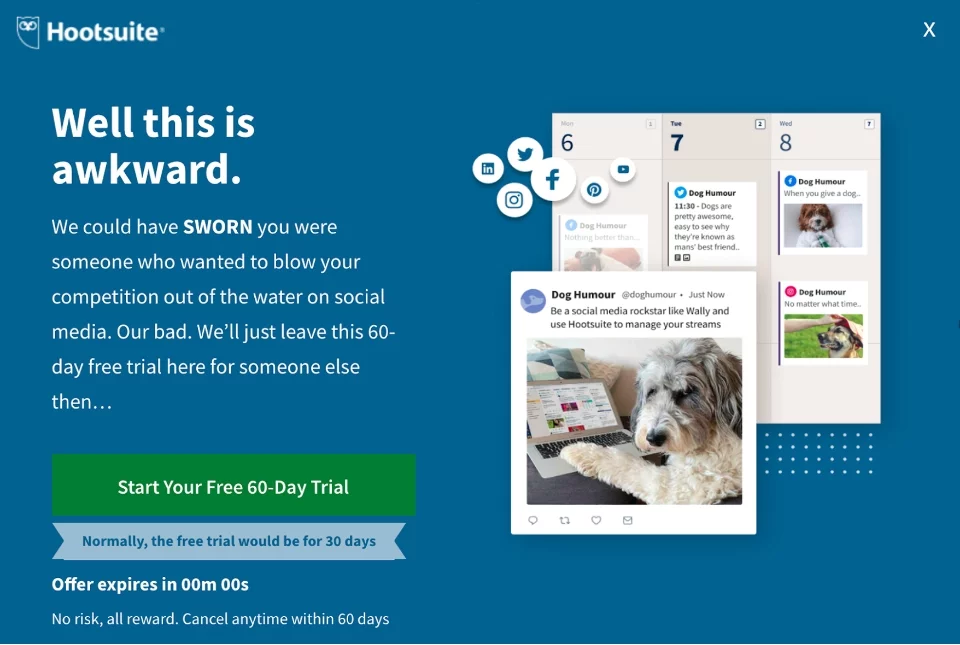
What’s beautiful about it:
It evokes emotion. It catches you off guard by reminding you that a human being wrote the lines you’re currently reading, because it talks to you like a human. And, of course, in combination with the cute dog that looks right at you, it makes you think: Well, I’ve got nothing to lose. Let’s start the trial and get this content automation party started.
Example 2: NetrixDigital
Another beautiful example (on an overall beautiful website) I found is the contact form on the NetrixDigital website. Let’s have a look:

Mit dem Laden des Videos akzeptieren Sie die Datenschutzerklärung von Vimeo.
Mehr erfahren
What’s beautiful about it:
This contact form is just fun to use. Like the example above, it manages to partly remove the barrier between the screen and the person filling it out.
This time, they do it by creating an organic feel within the very digital experience they offer. The lines are written on what feels like paper, and when you click a button it looks like you’re, imperfectly, outlining it with an orange pen.
It’s a very pleasant experience.
Even if you don’t want to work with them: You kind of want to hit that “Send” button just to see what happens.
Example 3: Multi-Step Form Done Right
This next conversion form is a nice example for multi-step forms (which can be quite boring to complete) that manage to keep the user engaged.
How do they do it?
Well, for anyone who’s not fluent in German, I’m talking about a form that lets users obtain an offer for photovoltaic systems. As you can imagine, the process is a bit more complicated than, let’s say, subscribing to a newsletter.
But the designers managed to make filling out the form a pleasant experience by using images. Without them, the whole process could be a bit dry, even dull.
Mit dem Laden des Videos akzeptieren Sie die Datenschutzerklärung von Vimeo.
Mehr erfahren
Choosing between different kinds of housing conditions or the various kinds of roofs is not only easier, but also more fun when you can just click an image that speaks more than a thousand words.
How to Build Conversion Forms in WordPress
Now that you’ve gained some – hopefully very helpful – input for your form conversions, can we just take a second and rant about conventional ways to create any types of forms within WordPress?
We’ve talked about why you should purge your WordPress contact form plugin before.
Many of them are not exactly GDPR compliant, and more often than not you’ll have to use another plugin if you want to use double opt-in.
Or you’ll have to pay for the premium version of a contact form plugin to be able to style the form according to your website (or, ugh, use custom CSS to match the design manually).
If you’re like me and you would rather focus on content instead of code, GREYD.SUITE is the answer for you.
GREYD.SUITE is the world’s first All-in-one WordPress Suite with a native Gutenberg integration.
It’s the perfect tool for WordPress web creators, and here’s why:
One of GREYD.SUITE’s cool features is GREYD.Forms: It helps you create clever forms super easily – no programming know-how needed. 🥳
Meet your future favorite form generator!
Let your visitors calculate interest rates, or even how many solar panels fit on their roof – live on your website!
Bottom Line
Creating conversion forms has never been easier, but creating good forms that actually convert might not be as easy as it sounds.
Remember these things to fall back in love with your conversion forms:
- The Mozart Method: Remove any hiccups that might occur within your conversion forms, so that users actually stay interested and complete the form.
- Identify user behavior by studying heat maps and adjust accordingly.
- If you’ve had enough of subpar contact form plugins, try GREYD.Forms instead.
- Don’t forget to have fun along the way!