
Table of contents
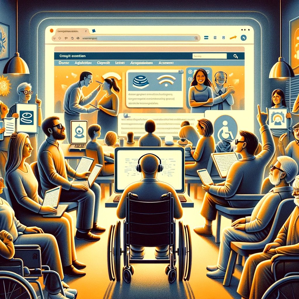
In the real world, there is a lot of barrier-free infrastructure like elevators, wheelchair ramps or special markings on the floor for visually impaired people to make our society more inclusive to everybody.
However, when it comes to the digital world, accessibility is often still a topic that many tend to ignore. But as the United Nations Convention on the Rights of Persons with Disabilities says, every human being has the right to enjoy equal rights and fundamental freedoms. Digital accessibility encompasses several topics. From code to design and even content creation. Which is why we will show you how you can be more digitally inclusive and create web content that ensures accessibility for everybody.
Compliance concerning accessible web content
To ensure equal access to digital information, the Americans with Disabilities Act (ADA) and the European Accessibility Act (EAA) already established some directives on how to create accessible content.
Since a lot of countries also have their own rules and regulations, it can be difficult to understand how to do the right thing in order to be more inclusive on your website. That’s why the web content accessibility guidelines (WCAG) exist. These guidelines are now an important standard for websites, documents, and software.
However, we think that these accessibility guidelines for websites should be treated as the bare minimum that can be done for people with disabilities. You can actually divide accessibility into three categories:
- A (low range)
- AA (mid-range)
- AAA (high range)
Although your goal should always be to aim for an AAA website, usually AA is achievable, but A is simply too little to be called accessible. After all, it’s not just about legal certainty, but about creating an inclusive digital space where everybody can enjoy content the same way. And you can gain a bigger audience from it.
The four principles of accessible web content
The web content accessibility guide consists of 13 precise guidelines and four principles that you should always keep in mind when creating content. When following these principles, you will for sure be able to provide accessible website content and design.
1. Perceivable
This principle states that information and user interfaces should be designed so that they can be perceived by all users, regardless of their limitations. This includes providing alternatives for non-textual content such as images, videos, or audio files so that users with visual impairments or other limitations can perceive the content.
2. Operable
This refers to the fact that users should be able to operate the user interface and navigation of the website, regardless of the nature of their disability or the devices they use. This includes features such as keyboard navigation, sufficiently large click areas for users with motor impairments and avoidable or customizable time limits for users with cognitive impairments.
3. Understandable
This principle suggests that web content should be clear and understandable so that all users, including those with cognitive or language limitations, can easily grasp the content. This includes the use of clear and simple language, consistency in navigation and layout, and the provision of help and explanations when needed.
4. Robust
Web content should be robust enough to be interpreted and processed by a variety of user agents, including assistive technologies. This means that the website should work correctly in different browsers and on different devices, and should not have technical barriers for users with disabilities.
7 tips for more accessible web content
A highly accessible website is characterized by a particularly user-centered, clear and simple design and meets the different requirements of people with disabilities. Assuring certain web content accessibility standards actually holds quite a few benefits for you:
- greater visibility and reach because more people can use your offer
- positive user experience for all users
- better chances of high rankings in the SERPs
- higher customer satisfaction
- more conversions and increase in sales
- legal certainty through conformity with current regulations
To make sure your content is designed for everybody, here are some of our best tips. So you can create more inclusive content according to the web content accessibility guidelines. And don’t worry, there is no such thing as 100% accessibility yet in the digital world. But still, it is about putting in effort and trying the best you can.
Intuitive structure and navigation
Intuitive structure and navigation means that the website is organized in such a way that users can easily understand where they are and how to get to the content they want. This includes the use of clear menus, a consistent page structure and well-placed navigation links. Other navigation elements are clearly recognizable and easily accessible.
Additionally, a clear hierarchy of headings (e.g., H1, H2, H3 etc.) and a logical arrangement of content will help to make navigation easier. This includes elements like bullet points, tables, or infographics. This ensures that users can find their way around the site, especially for those using screen readers.
Clear and simple language
The use of clear and simple language is crucial to ensure that all users can easily understand the content of the website. This includes avoiding complex technical terms, jargon and unnecessarily complicated wording. Instead, the text should be clear, concise, and easy to understand, ensuring that users with different linguistic abilities can easily grasp the content.
Also consider using shorter sentences and plain and simple vocabulary. You always want to make sure that children or foreigners could manage to understand your written content.
Accessible headings and links
Accessible headings and links involve the use of meaningful and descriptive text for headings and links so that users with screen readers or other assistive technologies can easily understand where the links lead to. Or what section of the page they represent.
Links should be self-explanatory on their own, meaning that if they are listed out of context, they still make sense to the visitor. Texts like “click here” are the opposite of that. There are users who will request their assistive technology to give them a link list. When the majority of links are called “click here” they don’t make any sense. And don’t forget: Google is blind, which means non-descriptive link texts are a missed SEO opportunity as well.
Make sure your content is marked up in the correct order so that the hierarchy makes sense and the meaning of the text is reinforced. This improves navigation and makes it easier for users with visual impairments to understand and navigate the content of the website and follow your message.
ALT texts for images
As you probably know, alternative texts (ALT texts) for images are short descriptions that are inserted into the HTML code to describe the content and function of images. These texts are used by screen reader programs to convey the content of images to users with visual impairments.
It’s important that your ALT texts really communicate the meaning of the image. Although they shouldn’t be too long either, and certainly shouldn’t include the words “image of” or “picture of”. By providing meaningful ALT texts, all users can grasp the content of the images, regardless of their ability to visually perceive the images.
Transcripts for audio and video content
Transcripts are written versions of audio and video content that reproduce the spoken content. They are crucial for users with hearing impairments, as they can understand the content of the audio or video content by reading the transcript. Providing transcripts also improves the findability of content through search engines and allows users to consume the content in environments where audio is not suitable.
When it comes to video content, you should also use closed captions. This refers to the written reproduction of media content that is played parallel to the content shown. Assuming that viewers can’t perceive any elements of an audio track, sound effects are also written down. Closed captions are normally displayed as subtitles at the bottom of the video screen and can be switched on or off, depending on the user’s preferences. There are several advantages of providing closed captions:
- They are indexed by Google
- Users can switch them on and off as they wish and also choose their size
- Most software that can generate captions will also generate the transcript
Provide accessible documents
Accessible documents involve providing electronic documents such as PDFs or Word documents that are designed to be accessible and can be used by users with various types of disabilities.
This includes the use of structured documents, clear formatting and ALT texts for non-textual content within the documents. Just with your website content, you should also include elements like headings and subheadings, you should use clear and simple language, and you could also provide a table of contents.
When it comes to accessible forms, you primarily need to make sure that input fields are correctly labeled. Especially placeholder texts can cause confusion for people with impairments that use screen readers, which is why correct labels are extremely important.
Also, try to communicate all steps of the form clearly. Give clear instructions on what to do, how to do it and how many steps will be necessary to complete the form. If information has been entered incorrectly, communicate errors as simply and clearly as possible.
However, feedback shouldn’t just be negative. Positive feedback is an important part of good communication. Therefore, give clear indications when everything went well. Every success while filling a form should be mentioned to give orientation. And don’t forget a message of reassurement after the form has been completed correctly.
High-contrast colors palette
A high-contrast color palette refers to the use of color combinations with sufficient contrast between text and background to improve readability for users with visual impairments. Sufficient contrast ensures that the text is clearly visible and stands out easily from its background, which is particularly important for users with visual impairments.
Avoid overly high contrast, though. Be aware also that for some people, especially people with dyslexia, a very high contrast color scheme can make reading more difficult. It’s a good idea to choose an off-white background color rather than a white background to aid on-screen reading. Or a dark gray text on a white background, instead of a pure black text.
Test your website to ensure accessibility
In order to create accessible content on your website you can use some handy tools and also do some tests to check for accessibility. Manual testing includes:
- Checking the website using the keyboard. This is how you can make sure that all functions and content are accessible using the keyboard without relying on the mouse.
- Take a look at the contrast between text and background to make sure it is sufficient, and check the readability of text and fonts.
- Ensure that navigation is logical and consistent and that all links and buttons are clearly labeled.
- Test your website with a screen reader program to ensure that all content is read aloud correctly and that reasonable ALT text is available for images.
- Take a look at the Core Web Vitals. They measure the overall user experience on your website and also take in consideration how accessible it is to users with disabilities. Generally, you should keep in mind that accessibility is an important metric for your website’s ranking in the search engines.
- The most important way to test your website for accessibility is by collaborating with disabled people. They usually know best what’s important for their inclusion when it comes to digital content.
To make sure your content is available for every user with or without impairments from the beginning on, we from Greyd have constantly been trying to make a more and more accessible experience possible. Since Greyd assures that all the code output fits when it comes to accessibility, you can therefore focus 100% on creating accessible design and content.
When working with Greyd.Suite you are given an accessible-ready tool, that provides you with blocks with appropriate semantic HTML and themes that are as accessibility-ready as possible. No matter if you want to include. popups, dropdowns or clickable boxes full of content. There will no longer be any issue with certain elements and their accessibility on your website.
If you are interested in learning more about accessibility on your WordPress website with Greyd and actually trying the features first hand feel free to book a demo with one of our experts.