Table of contents
- A conversation with Thomas Koschwitz
- What prompted you to relaunch the Greyd website?
- What are the most significant changes you have made to the front end?
- The whole design is much calmer, what were your thoughts?
- You used the new block theme (Greyd Theme). Did this simplify the process for you?
- Has dealing with accessibility influenced your design process?
- What has changed in the design process?
- What technical highlights would you highlight here?
- Do you have a specific example?
- What has changed in the Help Center?
- Don’t you think that “Reducing overheads as a challenge in redesign” could be a good title for this interview?
Anyone who has a large company website knows this. A relaunch is a good opportunity to overhaul more than just the design of your website.
In this interview, we look at the most important things that have been improved on the Greyd website and help center, both in the frontend and in the backend.
A conversation with Thomas Koschwitz
What prompted you to relaunch the Greyd website?
We keep getting feedback at personal demos about how great our product is. But we were also told that people couldn’t really understand our product from what they read and saw on our old website.
Over the years, the number of functions in our Suite has increased. As a result, we have gradually added more pages and sections. I think this is something that many software vendors recognize as they successfully grow. The messaging on our previous website needed improvement.
What are the most significant changes you have made to the front end?
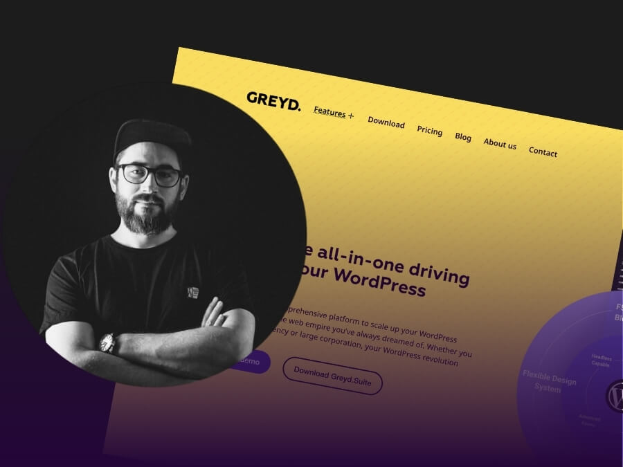
The visual design itself is just one part of a whole list of things we’ve done differently compared to the old site. We have completely redesigned our homepage and restructured it so that anyone scrolling down can quickly grasp what Greyd.Suite has to offer.
The menu has been simplified, the fonts have been enlarged – all steps towards making our site more user-friendly and accessible.
And last but not least, we now have a demo video on our website. It will show you in no time what the Greyd.Suite has to offer.
The whole design is much calmer, what were your thoughts?
I wanted to reduce the different design elements we had before to offer a clearer look that is less dependent on an icon language. The main focus was to be on the typography and the handling of spacing and column dimensions to make it much clearer. An important goal was also to improve the issue of contrast, especially towards accessibility in the UI. The fonts on the old website were definitely too small, and this also needed to be addressed. The aim was to improve the readability and scannability of the interface.
You used the new block theme (Greyd Theme). Did this simplify the process for you?
Definitely. With our new theme, I was able to better integrate and customize my design system. For example, I was able to adjust the spacing globally to create more differentiation in my spacing. We were also able to be more flexible with our color palette. Another advantage was that I could see and edit my CSS directly in the backend instead of always having to switch to the frontend. This made the design much easier and allowed me to focus more on graphic patterns in CSS, which in turn meant fewer server queries. Site speed isn’t just important for SEO, it’s part of sustainability.
Has dealing with accessibility influenced your design process?
Yes and no. On the one hand, I generally paid more attention to color contrasts and font sizes in the design. On the other hand, knowing that I was building website with an accessibility-ready theme gave me a certain peace of mind, as I knew that the technical basis was clean. I didn’t have to worry that I would immediately run into accessibility issues in standard situations. That gave me a degree of security as a designer.
What has changed in the design process?
Everything has changed. A website is a living object that grows and changes. I had to make sure that there was no uncontrolled growth. A big focus was on automation, both on the side of the Greyd main website and in our Helpcenter. Once a design system and patterns were established, I was able to concentrate on the backend architecture.
What technical highlights would you highlight here?
Using the full range of possibilities of our Suite for our own website this time, after such a long time is a highlight in itself. The fact that we could benefit from all the new functions and features that were added to the Suite between the time we built our previous website and the time we started this website. And to be able to use our new block theme was a big wish that I could now make come true.
Content management is overhead. With our Suite, we have the ability to reduce the complexity and time spent by the people managing our content. Features like global taxonomies, which allow you to create relationships between post types, ensure that information only needs to be entered in one place instead of manually updating it in two or three places. And we now make extensive use of the ability to create custom patterns and our dynamic templates so that no one accidentally breaks a layout. This saves a lot of overhead and keeps the website fast and easy to use.
Do you have a specific example?
Our feature page is a good example. It provides an overview right away. We have a post type that fills two pages. If the taxonomy is “not yet released”, the feature is shown on the roadmap page. If you change the taxonomy to “released”, it is automatically removed from there and ends up on the feature page.
What has changed in the Help Center?
We have given a lot of thought to how we could maintain the content from just one place. You can already use websites with Greyd .Suite like a headless CMS. With Global Content, you can store content globally and link it to multiple websites. But the question has been around for a while: “What about external content?” We have developed a headless API and our new Helpcenter is the first result of this.
In our help center, we have established a direct connection to HelpScout, the software we use for customer support, using this API. Tutorials and documentation are stored in HelpScout and we can automatically display them as articles. This means that we don’t have to maintain these posts in two different places.
Don’t you think that “Reducing overheads as a challenge in redesign” could be a good title for this interview?
Haha, yes, I understand what you’re getting at. I can only repeat it, as I always do in the demos. A strong aspect of Greyd.Suite is the ability to automate a lot. Our powerful filter options in query loops, both on normal pages and in the display of search results, for example, and features such as conditional content and, I’d like to repeat it again, the possibility of using cross-post-type taxonomies. This makes work easier for everyone who maintains content. It’s about time we integrated it here too!
